Skip to content
Graphic Design

A topic from several perspectives

Apply this topic to your work →

The Grid

Explore the grid through the perspectives below. Compare their examples and tradeoffs, then connect what you learn to your own work.

Illustrated study

One publication, different page structures

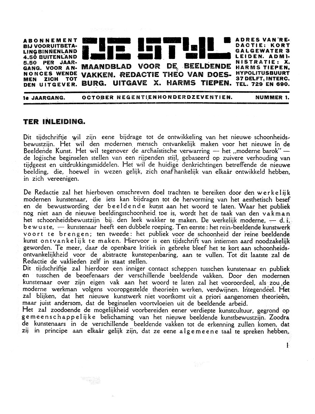
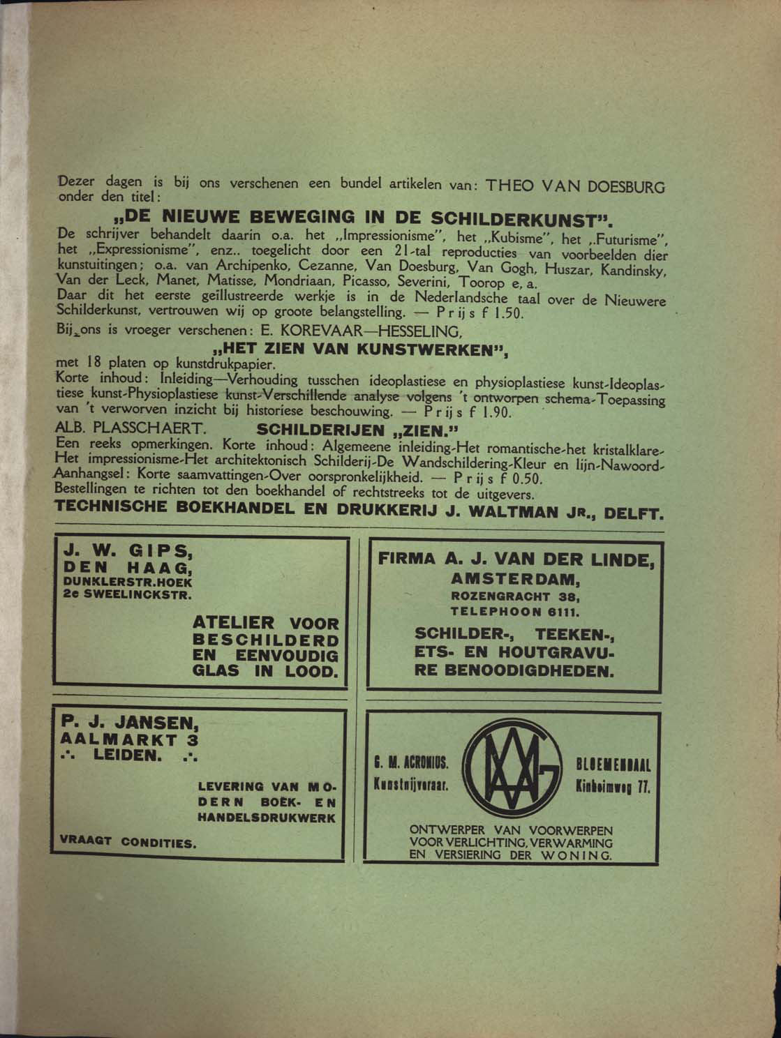
Compare the opening page and advertisements of the same issue of De Stijl.

Opening page of De Stijl with a block-letter masthead, small side columns, horizontal rules and a broad column of text.

Figure 1 · October 1917

De Stijl: opening page

The masthead divides information into aligned blocks, while the article below uses one broad column. Trace the shared edges to see how different zones remain part of one page.

Theo van Doesburg (text) · University of Iowa Libraries · International Dada Archive
De Stijl, vol. 1, no. 1, p. 1 · reproduction via Wikimedia Commons

View full size ↗Download image
Collection record and reuse rights

Display copies are resized and compressed. Source and license links apply to the image above.

De Stijl advertisement page with a wide upper text block and four boxed advertisements arranged in two columns below.

Figure 2 · October 1917

De Stijl: advertisement page

Four advertisements share a two-column structure, but each arranges its type differently. Compare the stable outer divisions with the varied spacing inside them; this is a reading of the page, not a reconstruction of the designer’s original grid.

Designer unrecorded · University of Iowa Libraries · International Dada Archive
De Stijl, vol. 1, no. 1, inside back cover · reproduction via Wikimedia Commons

View full size ↗Download image
Collection record and reuse rights

Display copies are resized and compressed. Source and license links apply to the image above.

Explore more museum and archive collections →

Learn from an example

Compare menus from another period

The New York Public Library’s Buttolph collection gives you historical menus to examine as original documents.

What it helps you understand

Choose two menus and compare how they group dishes, display prices, and use type. The comparison can suggest alternatives for your own layout; the archive alone cannot tell you which design helped guests order more easily.

Bring it to your work

Use the same dishes and prices in two layouts. Ask a reader to locate an item in each and note where they hesitate.

Graphic Design · The Grid

Make the underlying arrangement visible

Choose a page and infer its alignments. Treat your grid as a reading of the design, not proof of the designer's original method.

Try this

Trace columns, margins and repeated alignments. Mark the places that appear to depart from the pattern.

Reflect

Which departure helps communication, and what makes you think so?

Take it further · optional follow-up

Move one element off the traced grid while keeping the content fixed. Explain the reason for the exception and compare the reading order.

Compare with another activity · Education

The Blackboard: Show the development of an idea →

This opens a separate activity. Use Back to return to your sequence.

Explore another study sequence

Follow a question through three activities, with a worked example and a worksheet for your observations.

Prepared study prompt · not an editor-reviewed research article

Explore the perspectives

The eight prepared perspectives below are open to everyone. Sign in for expanded readings, a private notebook and collections.

Sign in for a deeper reading and notebook →

Historical

How did this evolve, and why has it endured?

Grids belong to a long history of arranging writing and images on a surface. Manuscript ruling, newspaper columns and modern editorial systems offer different examples. Compare actual pages before treating every ordered layout as an expression of one design movement.

Material

What is it made of, and why does that matter?

A grid must accommodate the surface carrying it: a folded sheet, a bound spread or a changing screen. Binding can conceal an inner margin, while a narrow display can make several columns impractical. The usable area is more consequential than the abstract rectangle.

Cultural

How have different societies approached this?

Reading direction, conventions of emphasis and the relationship between text and image shape a grid. A system designed for one language may need substantial revision for another. Examine which conventions a layout assumes its readers already understand.

Technical

How does it actually work?

Margins, columns, gutters and alignment lines establish repeatable relationships. Try placing a heading, a photograph and a caption on the same grid, then change their lengths. A useful system accommodates variation without making unrelated elements appear connected.

Sketch a program for three events, each with a title, time and location. Align the times so a reader can compare them, and keep each location visibly attached to its event. Now replace one title with a much longer one. Notice whether the structure still makes the right relationships clear.

Aesthetic

What makes it beautiful, meaningful, or enduring?

A grid gives repetition a structure and makes departures noticeable. An image crossing a column boundary can become an emphasis precisely because other elements observe it. Judge the resulting rhythm across several pages, rather than one attractive spread.

Human

How do people actually experience this?

Alignment and grouping help readers locate information and follow a sequence. A consistent grid can still produce a confusing page if headings, captions and body text compete. Ask a reader to find something specific and observe where they hesitate.

Imagine a visitor looking for the starting time of a workshop. Show two versions of the program with identical wording but different groupings. Ask the reader to find the time without explaining the layout first. Record where they look and whether they confuse a neighboring event's details with the one they want.

Economic

How has commerce shaped this?

Reusable layouts reduce repeated setup and help teams produce related documents. An excessively rigid template can move costs into awkward copy edits and exceptions. Compare the time saved in routine production with the work needed for unusual content.

Future

Where might this be heading?

A responsive grid can change as available space and content change. Its value should be judged by whether relationships remain intelligible across those conditions. Automated layout still needs explicit priorities about what readers should notice first.