Skip to content
Graphic Design

A topic from several perspectives

Apply this topic to your work →

Kerning

Explore kerning through the perspectives below. Compare their examples and tradeoffs, then connect what you learn to your own work.

Illustrated study

Reading the intervals between letters

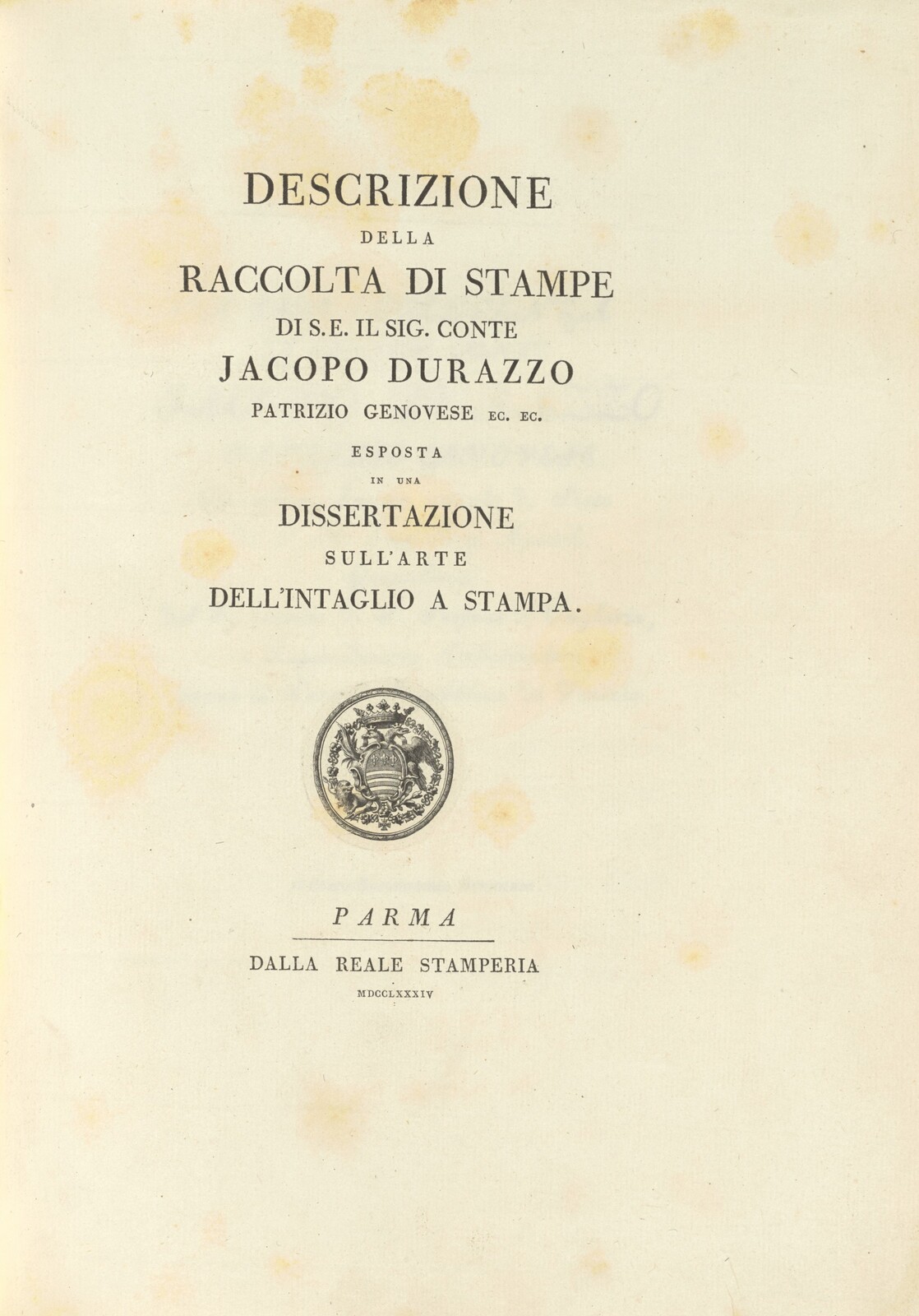
A Bodoni title page provides real letterforms for a close study of visual spacing.

Italian letterpress title page with centered lines of varying sizes, generous margins, a small heraldic emblem and publication details near the bottom.

Figure 1 · 1784

Title page: Descrizione della raccolta di stampe…

Choose one line of capitals and compare the white shapes between neighboring letters. Equal measured gaps need not look equal when letter shapes differ. This printed page does not reveal which pairs were individually adjusted. Use it to frame questions about pair spacing, then compare with a contemporary type specimen.

Bartolommeo Benincasa, author; Giambattista Bodoni, printer; dalla Reale Stamperia, publisher · National Gallery of Art, Washington
William B. O’Neal Fund · 2017.193.1

View full size ↗Download image
Collection record and reuse rights

Display copies are resized and compressed. Source and license links apply to the image above.

Explore more museum and archive collections →

Graphic Design · Kerning

Study the space between a pair

Use a short heading to examine the rhythm between letters. A pleasing pair in isolation may behave differently inside a whole word.

Try this

Make three versions of one heading with modest spacing changes. Compare the full word at its intended size.

Reflect

Which pair attracts attention unintentionally, and why?

Take it further · optional follow-up

Place each heading version into the same small layout. Choose one based on the whole word in context and describe the spacing problem it resolves.

Compare with another activity · Manufacturing

Tolerance: Define acceptable variation →
Connect this activity with other subjects

Follow a question through three activities, with a worked example and a worksheet for your observations.

Prepared study prompt · not an editor-reviewed research article

Explore the perspectives

The eight prepared perspectives below are open to everyone. Sign in for expanded readings, a private notebook and collections.

Sign in for a deeper reading and notebook →

Historical

How did this evolve, and why has it endured?

The spacing of particular letter combinations has concerned type makers across physical and digital processes. The available methods changed with the technology. A historical specimen should be read in relation to how its letters were made and assembled.

Material

What is it made of, and why does that matter?

Letter spacing is perceived through the shapes of marks and the spaces between them. Printing spread, surface texture and screen rendering can change that impression. Review a proof at final size before accepting spacing judged only on an enlarged screen.

Cultural

How have different societies approached this?

Different scripts have different shaping and spacing conventions. Methods used for a Latin capital pair should not be applied mechanically to connected writing systems. Language and script expertise belong in the evaluation of a multilingual setting.

Technical

How does it actually work?

Kerning adjusts spacing between particular glyph combinations; tracking adjusts spacing across a range of text. Examine pairs such as AV and To, then reread the complete word. Correcting one gap can create an uneven rhythm beside it.

Set the word WATER at a prominent title size. Compare the space around the diagonal strokes in WA and AT with the spaces elsewhere in the word. Adjust one pair at a time and keep the original beside the revision. Then reduce both to their intended display size before deciding whether the change helps.

Aesthetic

What makes it beautiful, meaningful, or enduring?

Optically balanced spacing does not require identical measured gaps. Diagonals, curves and vertical stems enclose different shapes of white space. Compare the word as a whole, looking for accidental holes or collisions.

Human

How do people actually experience this?

In a short title, irregular spacing can interrupt recognition and distract from the message. In body text, reliable font spacing usually matters more than hand-adjusting isolated pairs. Keep the intended reading distance and pace in view.

Imagine a short shop name whose letters appear to split into two groups because one gap is unusually wide. Ask someone unfamiliar with the name to read it before explaining the spacing issue. Their response may suggest a revision, but one reading does not establish how everyone will recognize the word.

Economic

How has commerce shaped this?

Manual kerning is most practical for prominent, relatively stable text such as a title or logotype. Repeatedly changing copy makes extensive manual adjustment costly to maintain. A well-made typeface and a clear proofing process reduce avoidable rework.

Future

Where might this be heading?

Automatic spacing tools can provide a starting point, but unusual letterforms and large display settings still invite judgment. Evaluate the result after text, size or font changes. A saved adjustment is not necessarily appropriate in a new context.