Skip to content
Graphic Design

A topic from several perspectives

Apply this topic to your work →

The Serif

Explore the serif through the perspectives below. Compare their examples and tradeoffs, then connect what you learn to your own work.

Illustrated study

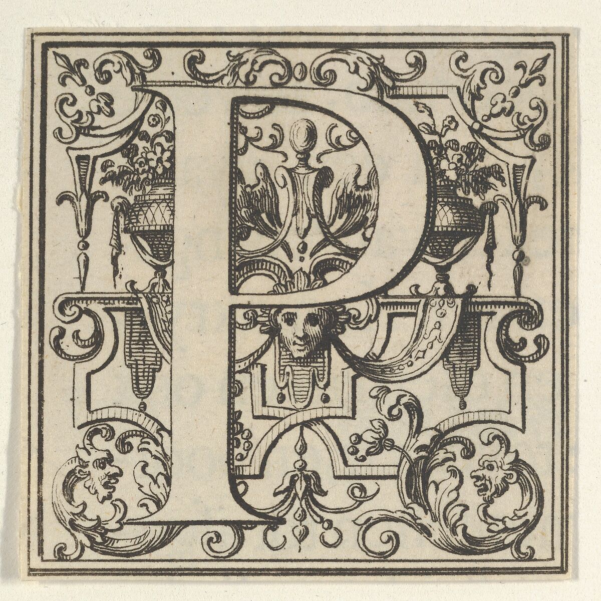
A letter within its ornament

An engraved capital makes the small endings of a letter large enough to examine.

Engraved capital P in pale relief against dense ornament, with a broad foot, curved bowl, scrolls, masks and a double-line square border.

Figure 1 · 18th century

Roman Alphabet letter P with Louis XIV decoration

Trace the outline of the P, setting aside the ornament behind it. Notice the short projection at the top of the stem and the spreading foot below: these endings belong to the letterform itself. Compare them with a capital P on a nearby sign or book cover. How do the endings, stroke widths and inner space change its character?

Bernard Picart · The Metropolitan Museum of Art
Purchase, Anne and Carl Stern Gift, 1959 · 59.507.8(14)

View full size ↗Download image
Collection record and reuse rights

Display copies are resized and compressed. Source and license links apply to the image above.

Explore more museum and archive collections →

Graphic Design · The Serif

Compare letterforms in context

Look at a serif face in a real paragraph rather than judging it from one large character. Describe what you can see without assigning universal personality traits.

Try this

Compare the same short passage in two available faces at similar apparent size. Note spacing, texture and word recognition.

Reflect

Which differences come from the typeface and which from its setting?

Take it further · optional follow-up

Compare the same samples at a second reading size. Record which judgments persist and which depended on the original scale.

Compare with another activity · Graphic Design

The Ligature: Examine a joined form →

Prepared study prompt · not an editor-reviewed research article

Explore the perspectives

The eight prepared perspectives below are open to everyone. Sign in for expanded readings, a private notebook and collections.

Sign in for a deeper reading and notebook →

Historical

How did this evolve, and why has it endured?

Serifs appear in many traditions of lettering and type design, but their forms and proportions vary. Compare particular inscriptions, printed pages and type specimens rather than attributing every serif to a single origin. A revival may reinterpret its model for a different production process.

Material

What is it made of, and why does that matter?

Fine details behave differently in ink on absorbent paper, an engraved surface and pixels on a screen. A delicate serif that looks clear at display size may lose definition when reduced. Examine the actual output at its intended reading size.

Cultural

How have different societies approached this?

A serif typeface can suggest institutions, books, fashion or familiarity through accumulated use. These associations depend on the audience and the particular design. The presence of serifs alone does not make a message authoritative or traditional.

Technical

How does it actually work?

Serifs are only one part of a typeface. Stroke contrast, letter width, x-height, counters and spacing also affect its behavior. Compare two serif faces using the same passage and adjust size optically rather than assuming identical point sizes look equal.

Set the same short passage in two serif faces, including capitals, lowercase letters, numbers and punctuation. Compare the apparent size of the lowercase letters before adjusting line length and line spacing. The useful comparison is between two complete settings, not simply two font names at the same point size.

Aesthetic

What makes it beautiful, meaningful, or enduring?

Bracketed, wedge-shaped and unbracketed serifs produce different transitions between stem and terminal. Look at the rhythm of a complete word as well as individual letters. The character of a face emerges through repeated relationships.

Human

How do people actually experience this?

Comfortable reading depends on type size, spacing, line length, contrast and the reader's circumstances. Avoid declaring all serif faces easier or harder to read. Compare realistic text under the conditions in which people will actually encounter it.

Imagine choosing type for a museum label. Read a proof at the distance from which visitors would encounter it, with the title and descriptive text together. Ask a fresh reader to find a date and read a sentence. Keep their observations about clarity separate from whether they like the style.

Economic

How has commerce shaped this?

Choosing a type family involves licensing, language coverage and the range of weights needed for production. A compelling headline face may require a separate text companion. Evaluate the complete working system before committing to a specimen's most attractive word.

Future

Where might this be heading?

New type designs can reinterpret historical forms for changing displays and reading situations. Assess their usefulness through actual text, language support and output quality. Novel features are valuable when they solve a particular design problem.