Skip to content
← Learning guide

The Ligature

← Back to study results
Other download formats

Illustrated study

Letters that hold on to each other

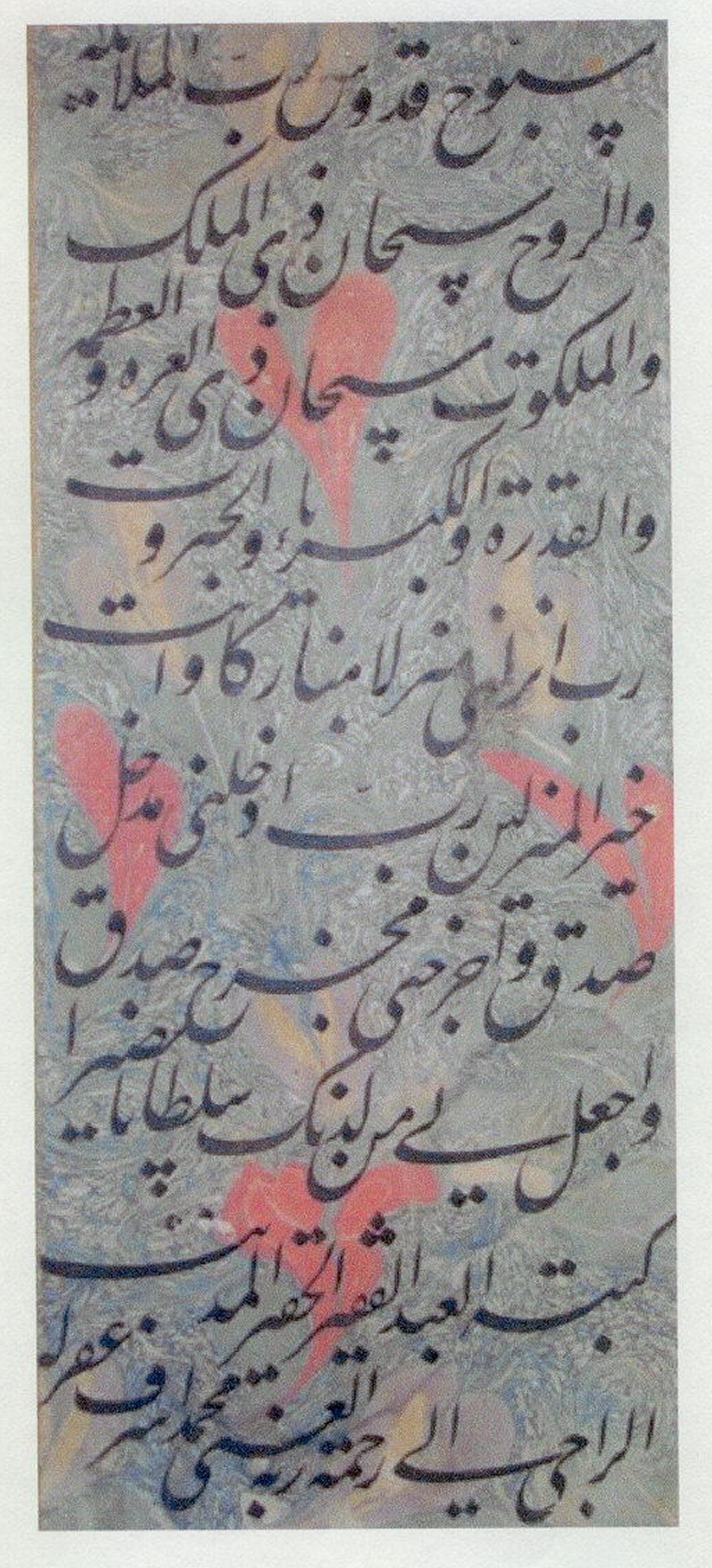
A Persian calligraphy page from 1658 joins letters into continuous strokes.

Page of Persian calligraphy in black ink with flowing joined letters, surrounded by ruled lines and panels of gold and blue watercolor ornament.

Figure 1 · 1658

Page of Calligraphy

Look for the places where one letter runs into the next without a break. In this script the joining is the writing itself rather than an occasional refinement, and the page is composed both to be read and to be looked at. Compare that with a Latin ligature, which joins two letters as an exception. What does each tradition ask a reader to notice?

Muhammad Ashraf Al-Radhawi · The Metropolitan Museum of Art
Purchase, Persian Heritage Foundation, 2002

View full size ↗Download image
Collection record and reuse rights

Display copies are resized and compressed. Source and license links apply to the image above.

Explore more museum and archive collections →

Graphic Design · The Ligature

Examine a joined form

Compare a word with and without an available ligature. Look at how the connection changes its rhythm and recognition.

Try this

Set a short phrase both ways and inspect it at reading size as well as enlarged.

Reflect

When does the joined form help the word, and when does it become the main event?

Take it further · optional follow-up

Check the joined and separate forms in a longer sentence. Note whether the join helps the text texture or makes a particular word harder for you to recognize.

Compare with another activity · Graphic Design

The Serif: Compare letterforms in context →

Prepared study prompt · not an editor-reviewed research article